css集成基础笔记
选择器大小排列
通配符选择器<标签选择器<类选择器<id选择器
向左滚动 可以用 <marquee></marquee> 标签
手机电话信息邮箱图片视频直接跳转

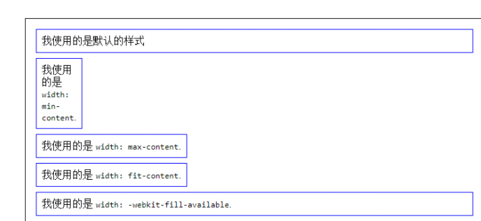
width相关使用

控制文本字行数
{
-webkit-line-clamp: 1;表示显示一行就隐藏
-webkit-line-clamp: 1;
    display: -webkit-box;
    overflow: hidden;
    text-overflow: ellipsis;
    -webkit-box-orient: vertical;
    display: -webkit-box;
}
手机导航左右拖拽css
<ul id="myTab"> <li class="nav-item"></li> <li class="nav-item"></li></ul>
#myTab{
list-style-type: none;
display:-webkit-box;
display:-webkit-flex;
display:-ms-flexbox;
display:flex;
-webkit-flex-wrap:nowrap;
-ms-flex-wrap:nowrap;
flex-wrap:nowrap;
-webkit-box-pack:justify;
-webkit-justify-content:space-between;
-ms-flex-pack:justify;
justify-content:space-between;
padding:0;
overflow:auto;
overflow: auto;
overflow-x: scroll !important;
-webkit-overflow-scrolling: touch;
touch-action: pan-x; /* 允许水平滑动 */
scroll-snap-type: x mandatory;
}
#myTab .nav-item{
-webkit-box-flex:1;
-webkit-flex:1 0 auto;
-ms-flex:1 0 auto;
flex:1 0 auto;
color:white;
padding:0 5px;
}
单独时 iPad要加js
document.querySelector(".gallery-box").addEventListener("touchmove", function (e) {
e.stopPropagation();
}, { passive: true });
多个iPad要加js
document.querySelectorAll(".gallery-box").forEach(function (el) {
el.addEventListener("touchmove", function (e) {
e.stopPropagation(); // 阻止事件冒泡,确保滑动生效
}, { passive: true });
});
网站名标题旁边 加图标
<link rel="shortcut" type="images-/x-icon" href="路径图片"> 图片大小为16x16px
1、outline:none; 去除点击input标签时的边框
2、max-width: 1200px; 设置段落的最大宽度
display: inline-block;
文本两边对齐
text-align: justify;
text-justify: inter-ideograph;
3、!important 使自身优先级为最高
如:div{
background-color:#fff !important;
word-break: break-all; /*自动换行*/
cursor:pointer //鼠标手势
兼容样式:
user-select, none
-webkit-user-select:none
-moz-user-select:none
-ms-user-select: none
}
4、行业主流清除浮动
选择器(类 或id,css为例.clearfix)添加一个特定的类 为清除浮动
.clearfix:after{
content: '';
display: block;
width: 0;
height:0;
visibility: hidden;
overflow:hidden;
clear: both;
}
.clearfix:after{
content: '';
display: block;
clear: both;
}
.clearfix:after/before:可以在某个标签的前面或者后面添加一个虚拟元素,需结合content使用
闭合浮动,左右都浮动
.clearfix:before,.clearfix:after{
content:'';
display:table;
}
.clearfix:after{
clear:both;
}
.clearfix{
zoom:1; //ie6
}
5、定位 position :fixed (固定定位),relative (相对),absolute(绝对) 方位值 top bottom left right
6、z-index: 设置非static 值的定位元素的层级
7、背景处理
background-size:px/cover/contain 等比缩放
background-position:30% 50%;背景位置
backgroun-size:cover //图片整体缩放
8、盒子里面用百分百来控 内边距 或边框的值 ( padding/ border);
用box-sizing: border-box; 使( padding/ border)值包括在盒子里面
9、文本两边对齐
text-align: justify;
text-justify: inter-ideograph;
10、内容居中的3种方法
div{
(1)
position: absolute;
left: 50%;
top: 50%;
-webkit-transform:translate(-50%,50%);表示div 向左向高 50%,在这基础再一次 向左向高 50%;
(2)
display:flex;
align-items:center;
justify-content:center;
(3)
display:grid;
place-items:center;
text-indent: -9999px; //做seo考量的
}
div{
width: 800px;height: 200px;margin: 0 auto;background: pink;
/*把盒子变成弹性盒模型*/
display: -webkit-box;
}
/*把div里面的子元素,既没有宽度;也没有浮动*/
/*把div里面的子元素,既没有宽度;也没有浮动*/
/*如:*/
div p:nth-child(1){background: red;-webkit-box-flex:1;}
div p:nth-child(2){background: red;-webkit-box-flex:2;}
div p:nth-child(3){background: red;-webkit-box-flex:3;}
/*意思是 p元素分别按div的1:2:3*/
9、固比固
快速写
background:url() no-repeat 30% 50%;
*{
margin:0;
padding:0;
}
* 建议不用,非常占用性能
多元素选择器常见的有
body,
div,
ul,
li,
iframe,
img,
form,
h1,
h2,
h3,
h4,
h5,
h6,
dl,
dt,
dd,
table,
td,
th,
tr,
p,
a,
span {
margin:0;
padding:0;
border:none;
}
ul,
ol,
li{
list-style: outside none none;
水平间距
letter-spacing:1px
垂直间距
line-height:1rem
lilin
}
a{
text-decoration:none;
}
使图片旋转
img{
-webkit-transition: all 1s;
}
img:hover{
-webkit-transform: rotate(360deg);
}
原地360度旋转
div{
-webkit-animation: animal 8s infinite linear ;
-webkit-transform-origin: center center;
-ms-transform-origin: center center;
transform-origin: center center;
}
@-webkit-keyframes animal {
0%{
transform:rotate(0deg);
-ms-transform: rotate(0deg);
-webkit-transform: rotate(Odeg);
}
100%{
transform:rotate(-360deg);
-ms-transform:rotate(-360deg);
-webkit-transform: rotate(-360deg);
}
}
背景游走飘动
.Xy41Kvfn8OmrAd6ZmErQ {
width: 400px;
height: 400px;
overflow:
hidden;
animation:
NXFsUeMV18lHDhhBAfOJ 25s
ease-in-out infinite alternate both;
}
0%, 100% {
border-radius: 63% 37% 54% 46% / 55% 48% 52% 45%;
}
<style>
14% {
border-radius: 40% 60% 54% 46% / 49% 60% 40% 51%;
}
<style>
28% {
border-radius: 54% 46% 38% 62% / 49% 70% 30% 51%;
}
<style>
42% {
border-radius: 61% 39% 55% 45% / 61% 38% 62% 39%;
}
<style>
56% {
border-radius: 61% 39% 67% 33% / 70% 50% 50% 30%;
}
<style>
70% {
border-radius: 50% 50% 34% 66% / 56% 68% 32% 44%;
}
<style>
84% {
border-radius: 46% 54% 50% 50% / 35% 61% 39% 65%;
}
隐藏四种
opacity: 0; 1
visibility: hidden; visible
position: absolute
img#dice { position: absolute; left: -1000px; }
img#dice { display: none; }
划过图片动画缩放效果
.blogs .blogpic :hover img {
transform: scale(1.1);
}
.blogs .blogpic img {
width: 100%;
height: auto;
-webkit-transition: all 0.6s ease;
-moz-transition: all 0.6s ease;
-o-transition: all 0.6s ease;
/* transition: all 0.6s ease; */
margin-bottom: 10px;
}
边距等比缩放
方法 1:使用 vw 单位
vw 代表视口宽度的 1/100,适用于 宽度自适应。
cssCopyEdit.ptb72 {    padding: calc(72px * (100vw / 1920));  font-size: calc(72px * (100vw / 1920));
}
方法 2:使用 clamp() 限制最小/最大值
防止 padding 过小或过大,可以使用 clamp():
cssCopyEdit.ptb72 {    padding: clamp(24px, 3.75vw, 72px); font-size: clamp(24px, 3.75vw, 72px);
}
在一定高度就可以开始下拉,滚动条同时是隐藏的
.container { height: 1000px; overflow-y: scroll; scrollbar-width: none; /* Firefox */
-ms-overflow-style: none; /* Internet Explorer 10+ */}.container::-webkit-scrollbar { display: none; /* Safari and Chrome */}
.box {
overflow-y: scroll;
}
.box::-webkit-scrollbar {
width: 12px; /* 滚动条的宽度 */
}
.box::-webkit-scrollbar-thumb {
background-color: #888; /* 滚动条滑块的颜色 */
border-radius: 10px; /* 滚动条滑块的圆角 */
}
.box::-webkit-scrollbar-track {
background: linear-gradient(to bottom, #EB6100, #FFFFFF); /* 滚动条轨道的渐变背景 */
}
线东
.line { width: 0px; height: 2px; background: #333; -moz-transition: all 5s ease; -webkit-transition: all 5s ease; transition: all 5s ease; }/* line 过渡*/
.newblogs li:hover .line { width: 100%; }
背景左侧的背景
width: 740px;
overflow: hidden;
background: url(../images/r_line.jpg) repeat-y right;
图片自动旋转
img{
cursor: pointer;
-webkit-animation: spinner 3000ms infinite linear;
animation: spinner 3000ms infinite linear;
}
伪类使用
.hnav a:after {
position: relative;
content: "/";
right: -10px;
bottom: 0;
color: #ccc;
}
导航下划线滑过左右移动效果
li{position: relative;}
li::before {content: ""; position: absolute; top: 0; left: 100%;width: 0; height: 100%;border-bottom: 2px solid #fff;transition: 0.2s all linear;z-index:-1;}
li:hover::before { width: 100%; left: 0;z-index:-1;}
li:hover ~ li::before {left: 0;z-index:-1;}
<!--头部 ico 图标 添加 favicon.ico --> 把favicon.ico直接放到根目录
<link rel="icon" type="image/x-icon" href="favicon.ico">
<body onpaste="return false" oncontextmenu="return false" oncopy="return false" oncut="return false">
onpaste="return false" oncontextmenu="return false" oncopy="return false" oncut="return false"可以防止文本被复制
要实现除了前两个 <li> 元素以外的所有 <li> 元素都具有红色背景,可以使用 CSS 中的 :not() 伪类结合 :nth-child() 选择器。以下是实现该效果的 CSS 代码示例:
ul li:not(:nth-child(-n+2)) { background-color: red;}
想改变img 里面svg格式图片的颜色
{filter: invert(35%) sepia(80%) saturate(500%) hue-rotate(200deg);} 其中filter这个改成自己喜欢的颜色就行了模糊效果css
filter: blur(11px);或者backdrop-filter: blur(11px);
实现子元素的顺序变换。order: 1; 数字小展示就越靠前
.anli {
display: flex;
/*
align-items: center;
justify-content: center;
*/
}
.anli-pic {
order: 2; /* 设置顺序 */
}
.anli-text {
order: 1; /* 设置顺序 */
}
